There are more and more sites that are using visual tools to illustrate banks, the credit crisis and other trends.
Mint is particularly good at doing this, and there is also a nice little video about the credit crisis that makes it simple to understand.
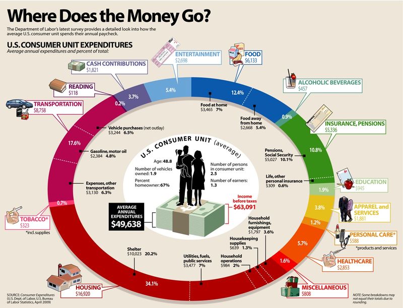
And then today, I stumbled across Visual Economics, a great little website that shows you exactly how the average American consumer spends their paycheck(doubleclick to see larger picture):
Or how credit card companies are not always serving the interests of their customers:

There are quite a few others in there as well.
Intriguing ...
Chris M Skinner
Chris Skinner is best known as an independent commentator on the financial markets through his blog, TheFinanser.com, as author of the bestselling book Digital Bank, and Chair of the European networking forum the Financial Services Club. He has been voted one of the most influential people in banking by The Financial Brand (as well as one of the best blogs), a FinTech Titan (Next Bank), one of the Fintech Leaders you need to follow (City AM, Deluxe and Jax Finance), as well as one of the Top 40 most influential people in financial technology by the Wall Street Journal's Financial News. To learn more click here...