There has been lots of conversation about the disaster of financial markets over the last year, but not many placed to go to find the whole thing mapped out clearly.
The BBC has quite a good site that monitors the key events and the Credit Writedown is doing a good job of monitoring the bank write-offs so far, but really mapping the whole thing out?
Well, there is one place you can go to get a true view of the whole thing.
The Federal Reserve.
Guess what?
They've got two documents with web links for every event that maps out the whole crisis from start to finish now.
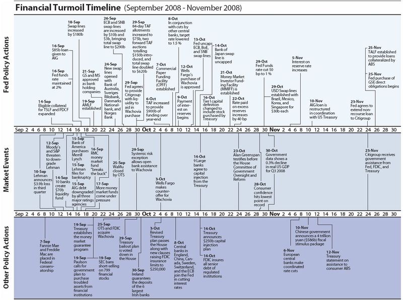
One document charts the US market issues. For example, here's last September-November (doubleclick to see in large screen view):
A second document charts the international actions. For example, here's November 2008 through March 2009:

Boy, these charts are busy aren't they?
Luckily, the more recent ones seem to be quieting down a bit. Let's hope it stays that way.
The charts are updated on the first of each month and are worth tracking.
The Finanser is sponsored by Vocalink
and Cisco:

For details of sponsorship email us.
Chris M Skinner
Chris Skinner is best known as an independent commentator on the financial markets through his blog, TheFinanser.com, as author of the bestselling book Digital Bank, and Chair of the European networking forum the Financial Services Club. He has been voted one of the most influential people in banking by The Financial Brand (as well as one of the best blogs), a FinTech Titan (Next Bank), one of the Fintech Leaders you need to follow (City AM, Deluxe and Jax Finance), as well as one of the Top 40 most influential people in financial technology by the Wall Street Journal's Financial News. To learn more click here...