Every three months my accountant asks me to send them my bank statements to do the company’s VAT returns. It’s annoying but hey, no one can access my bank account except me. But then something happened recently. The company’s bank accounts are with Barclays, and they changed the interface or did something so that, when you try to login, the system no longer works.
I’ve been used to using PINsentry for access for almost a decade. This is a way of generating a remote one time password using a card reader or mobile, as a secure way to gain access.
The thing is that recently, although it may always have been this way, Barclays changed the access to PINsentry so that, online, it asks you whether you are trying to enter via the mobile app or via PINsentry. So, I always choose PINsentry and get annoyed because it does not give access. After going round and round in circles, I call the bank and ask them why I cannot access my account? Then, just as I call them and get a customer service agent, realise I’ve done the same thing as three months ago. I had not looked closely enough and realise that, on their app, they have two options: “mobile access” and “PINsentry with card reader”. I had been clicking on the latter one, not realised that this means I use the card and not the “mobile PINsentry” option I was used to.
How annoying.
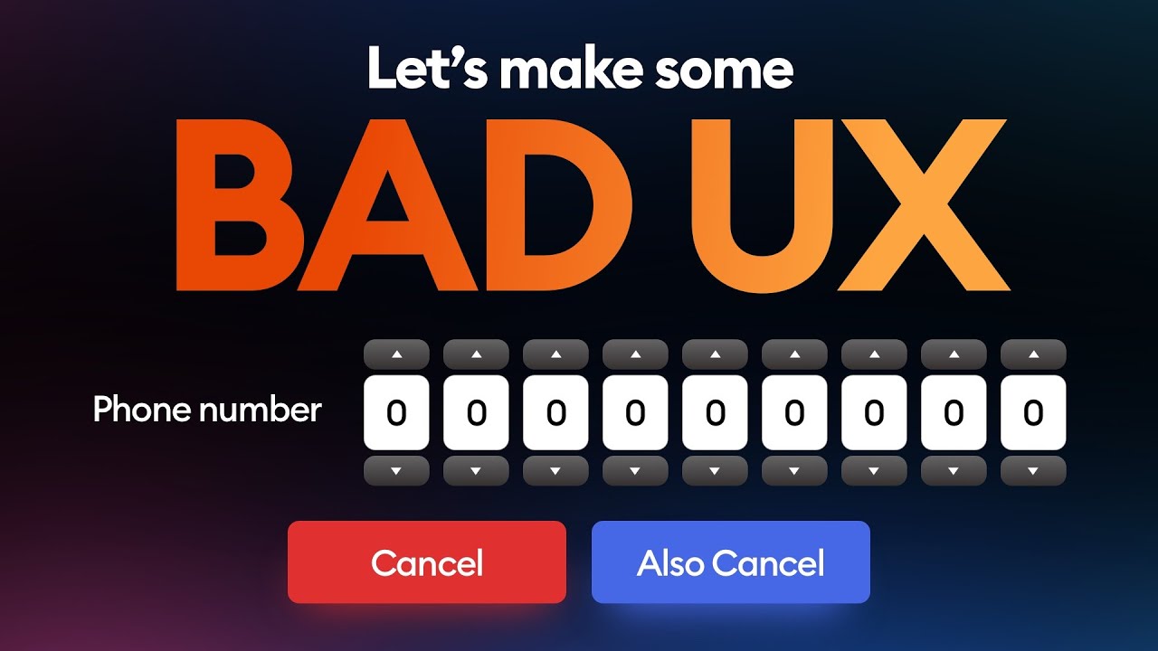
For me, this is a fundamental design fault which is not unique to BARCLAYS BANK, but is something experienced with many. It makes you wonder how many of the people who design these things actually go through the customer journey however.
As banks shut down all branches, force all customers to self serve, digitise everything: do they actually try out and use their services.
In this case, it’s purely the difference between hwo you identify for access between mobile and a card reader. If that was the title in the app, it would be clear. However, to title one is access via mobile and the other via PINsentry (with a card reader), it is incredibly confusing to the user experience.
Some may even say: why does it have to work this way?
But then, as I have mentioned many times, digital access is broken.
The systems don’t work and the processes are awful. Then, add onto this that physical access – whether by phone or in person – is terrible, the digital world of 2025 is 100x worse than the design we would have made.
This does not just apply to banks, but to all things we have today.
The critical aspect is that if we can self-serve digitally, then that’s fantastic; however, if the self-serve process breaks, there needs to be clear support structures that do not require an hour waiting on a telephone line.
This is not the digital world we envisioned or designed. It is not working and has too much fragmentation.
Meanwhile, going back to the irritation with PINsentry: has anyone at Barclays actually had a customer journey?
Chris M Skinner
Chris Skinner is best known as an independent commentator on the financial markets through his blog, TheFinanser.com, as author of the bestselling book Digital Bank, and Chair of the European networking forum the Financial Services Club. He has been voted one of the most influential people in banking by The Financial Brand (as well as one of the best blogs), a FinTech Titan (Next Bank), one of the Fintech Leaders you need to follow (City AM, Deluxe and Jax Finance), as well as one of the Top 40 most influential people in financial technology by the Wall Street Journal's Financial News. To learn more click here...